


S O W
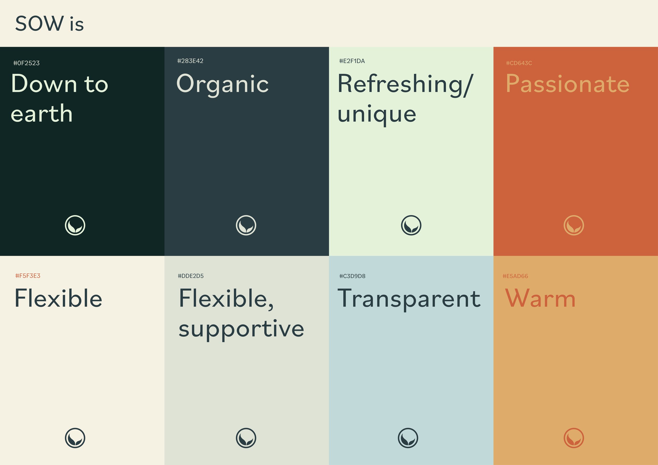
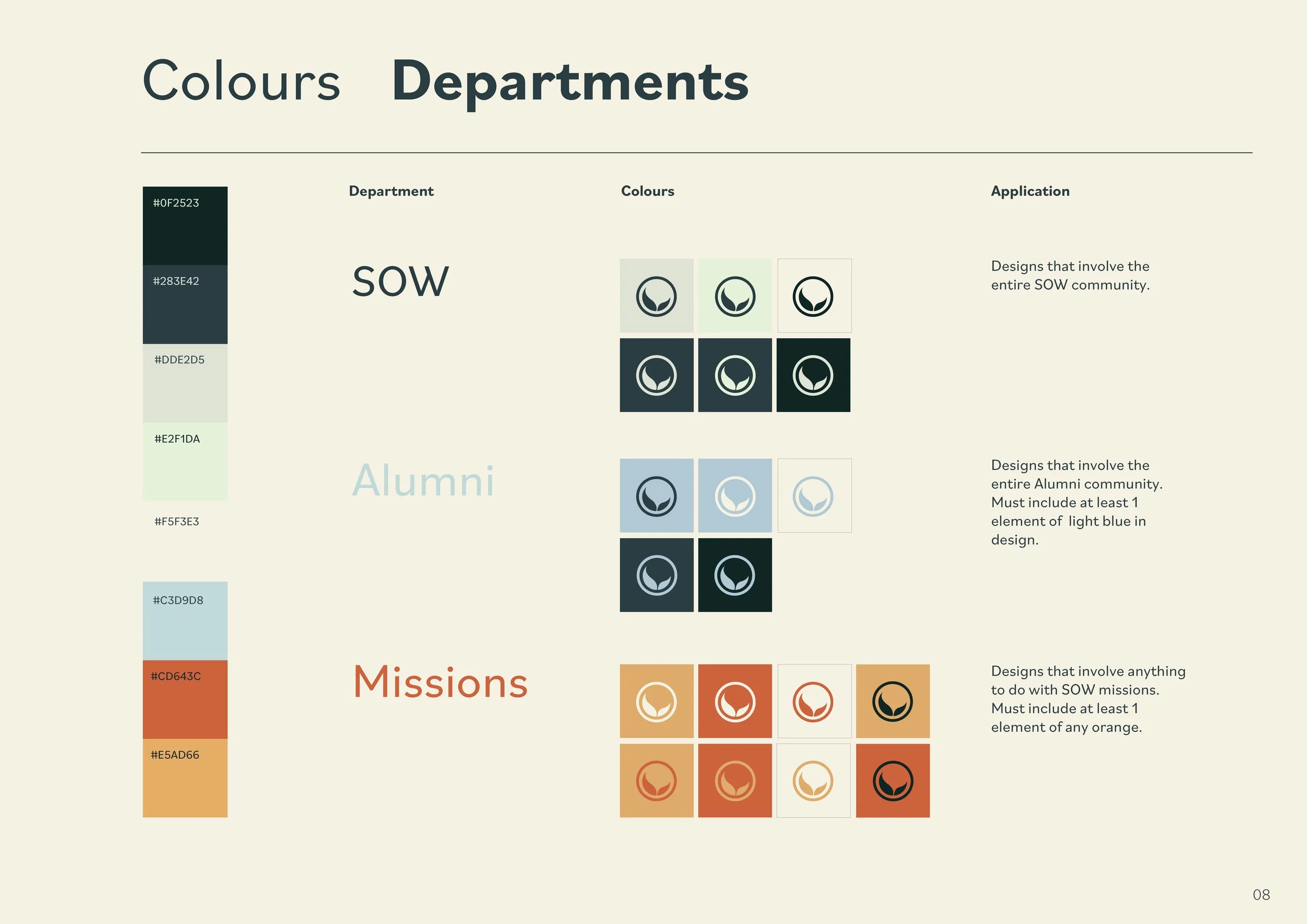
Green tones work together with the icon of leaves which represent growth. This imagery is linked to the vision of growth in the external community, uni-student resources and the alumni community.

A L U M N I
Blue helps to balance the overall colour scheme. It is a colour that is cool and more “behind the scenes” compared to the eye- catching presence of orange. Similarly this represents the alumni community.
By providing a separate branding for Alumni, it reveals that SOW cares and puts in the effort to give something back to them as they support the ministry.

M I S S I O N S
Orange plays the role of an accent colour, which brightens the colour palette. Similarly, missions is a department that is highly encouraged to members. In the same way, the colour is eye-catching and crucial to the branding.


SOW Branding.
Student Outreach to the World
✎ Adobe InDesign & Adobe Illustrator
New colours, fonts, brand guidelines and logo adjustments.
A new branding was created to better reflect SOW’s unique personality, strengths and goals as a ministry. Especially as they are now moving towards a greater trajectory in legitimising themselves in the community, there was no better way to begin solidifying their identity.